PeopleSoft UI Showcase July 30, 2019
Posted by Duncan in PeopleTools, UI Showcase, UX.comments closed
While commuting this morning I listened to Dan & Kyle’s podcast with Matthew Haavisto and they discussed that fact that the Fluid UI has been around for a while (since Tools 8.54, which was more than 5 years ago). It struck me that most clients will have adopted Fluid by now and branding is getting easier so there should be lots of good examples out there.
My mind drifted back to the company I worked for previously where we had a ‘UI Showcase’ of PeopleSoft branding eye-candy to drop into presentations to get people dreaming of the ‘art of the possible’.
The UI Showcase really started when we wanted to share the work we did for Pret a Manger, the high-street retailer. It looks really dated now, but back in 2009 it was pretty exciting.
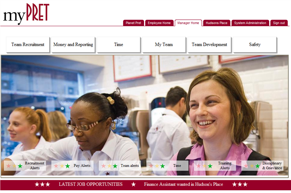
The burgundy tabs across the top were role-based homepages, the chunky white buttons at the top were tiles that accessed Nav Collections and the semi-transparent alert boxes over the lower section of the image were alerts where the stars changed depending upon different PS query thresholds. Much of this has parallels to the Fluid UI we have today.
On the Podcast, Matthew said that he’d seen some pretty creative uses of Fluid UI but I’m not sure many of those customers who’ve really pushed the boundaries have shared their work publicly. I’d really like to see them, and I bet many others would too. Maybe we could do something similar to a PS UI Showcase again, but on a wider scale?
I thought perhaps I’d start a series of posts, each highlighting a customer who has done something impressive and eye-catching with Fluid might be fun. Then the community would have something to flick through for inspiration when designing your latest refresh. Get in touch (duncan@peoplesofttipster.com) if you’re proud of your Fluid deployment – it can be anything, a cool tile, a great overall design, etc – and we’ll sort out how to feature you.
Interesting PS Roadshow / Exec Dinner Snippets May 4, 2017
Posted by Duncan in Cedar, SelectiveAdoption, UKOUG, UX.comments closed
We recently held the annual PeopleSoft Roadshow and Executive Dinner (summary here) and I wanted to highlight a couple of observations that I think are important enough to be revisited:
Fantastic UI
While Marc was demoing some new functionality it struck me how big a stride the PeopleSoft UI has taken over the last few years.
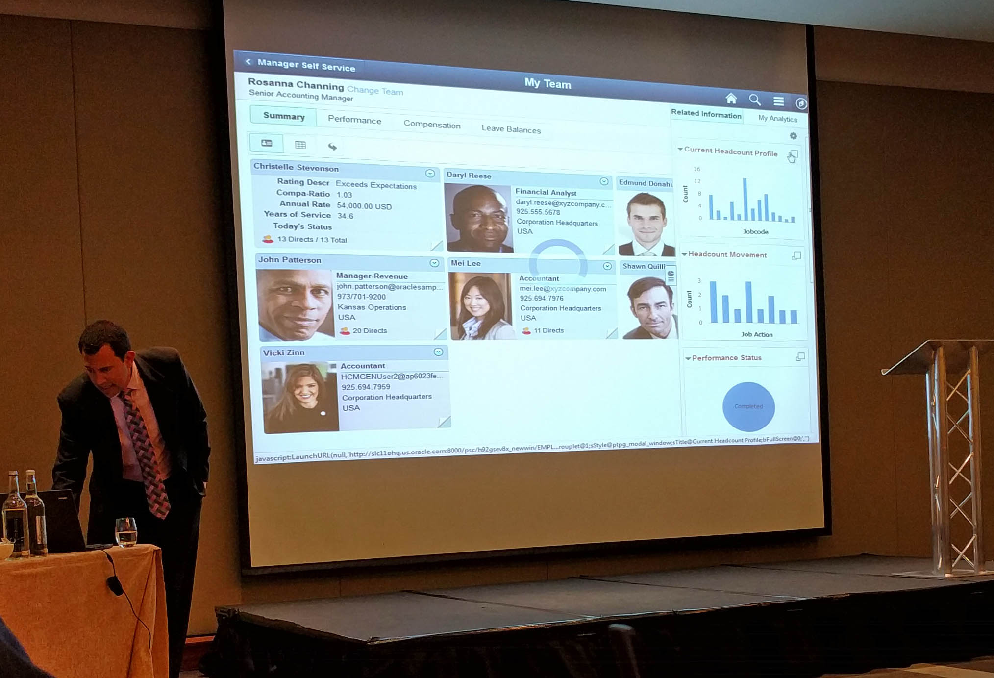
If you’d shown me this picture a few years ago I’d have refused to believe that it was PeopleSoft. Very few applications can boast a UI as attractive as this.
Selective Adoption is being Aggressively Adopted
Julie Alonso showed this slide, detailing how many customers are really making the most of Selective Adoption.
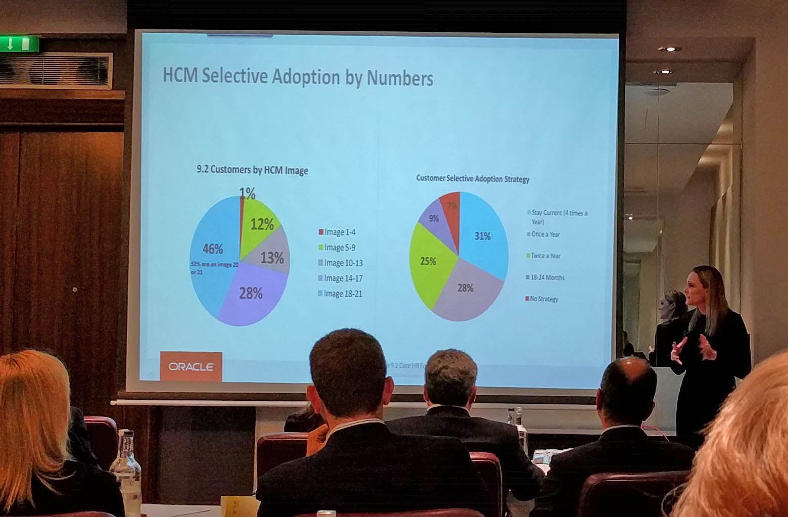
You might need to click these to see full-size, but let me highlight the key point. The right-hand pie-chart shows that 31% of customers are ‘staying current’ – i.e. doing a get current 4 times a year! A further 25% are getting current twice a year. So more than half of customers are getting current at least twice annually. I think this is really tremendous take-up of the benefits of Selective Adoption – and the PeopleSoft team must be delighted. I had fully expected most customers to lapse into an annual update.
Adding Watermarks to PeopleSoft fields February 11, 2015
Posted by Duncan in TW, UX.comments closed
The Cedar tech team has recently discovered a great tweak to improve the end-user experience in PeopleSoft.
Many well designed websites use Watermark text to provide a visual hint to the user what they should put into a field. We felt that PS Self Service users would appreciate the enhancement.

Head over to the Cedar Blog to find out more:
http://www.cedarconsulting.co.uk/news-details/February-2015-Adding-Watermarks-to-PeopleSoft-Fields/
